
btrax Website Redesign
Project Overview
btrax is a design and innovation agency with teams in San Francisco and Tokyo, supporting clients across branding, service design, and market expansion. As the company evolved, its website no longer reflected the agency’s creative maturity, energy, or strategic positioning.
This redesign focused on modernizing btrax’s digital presence, visually and structurally, by updating the design system, improving storytelling across key pages, and introducing scalable CMS and automation workflows to support marketing, recruiting, and content distribution.
“The goal wasn’t just to refresh the site, it was to make it feel modern, energetic, and credible at first glance.”
Timeline
4 months (accelerated)
My Role
Design Direction + Web Design + Brand System Refresh + Framer Development + Framer CMS + Motion & Micro-Interactions
Client
btrax
Website Link
Tools
Figma + Framer + Google Sheets + Zapier + Formspark + Mailchimp + Adobe Premiere Pro + Adobe After Effects
My Role & Ownership
I served as the primary web designer and owner of the redesign, partnering closely with a project manager and two other designers to deliver the project on a compressed timeline.
I was directly responsible for:
Creative direction and visual system
Hero motion and video concept, design, and production
CMS architecture and reusable components
Framer build and implementation
Quality assurance across devices and browsers
Launch and post-launch ownership
I assisted with content migration by validating and implementing content gathered by the team, and I directly owned QA, ensuring layout integrity, responsiveness, and content accuracy before launch.
I collaborated closely with marketing, leadership, and the Japan team to align brand vision, messaging, and execution across regions.
The Challenge
The previous site functioned but no longer met expectations for a modern design agency website.
Key challenges included:
A visual style that felt muted and outdated, with dull colors and a serif typeface that no longer reflected the brand’s energy
Limited motion and interaction depth
Pages—especially the homepage and About page—that lacked clear, scannable storytelling
No scalable system for careers or long-term content growth
Missed opportunities for discoverability through structured content and schema
The challenge wasn’t fixing something broken — it was raising the bar.
Goals & Success Criteria
Explicit goals
Introduce motion, micro-interactions, and depth through layered layouts
Update the color system to be brighter, bolder, and more energetic
Replace outdated typography with a more modern, flexible system
Improve storytelling across the homepage and About Us page
Strengthen credibility at first glance
Implicit goals
Improve scalability and maintainability
Ensure the homepage clearly summarizes who btrax is in one pass
Encourage visitors to explore deeper pages
Personal success metric
Success meant delivering a site that felt on par with standout projects in the Framer community—something designers would admire and clients would trust.
“I wanted the site to feel like something people would want to reference — or even aspire to build themselves.”
Visual Direction & Rebrand Exploration
Strategy: Page Hierarchy & Storytelling
The homepage was intentionally structured to prioritize positioning and credibility before navigation or conversion.
Because btrax operates as a strategic bridge between the U.S. and Japan, the top of the page immediately establishes:
Who btrax is
Where the team operates
Why cross-market expertise matters
This is reinforced through a custom hero video that sets tone and energy at first glance—introducing btrax’s identity and showcasing the breadth of work to quickly build excitement and credibility.
Only after that foundation is set does the page introduce services, work, and deeper content.
Key hierarchy decisions
Lead with identity and differentiation, not services
Reinforce trust early with selective work previews and credibility signals
Delay detailed service navigation until context is established
Use thought leadership as secondary engagement
Reserve conversion actions for users already invested in the story
This approach ensured the homepage functioned as a strategic entry point, not a transactional landing page.
About Us Page: From Brand Vibes to Clear Positioning
A major focus of the redesign was the About Us page, which previously leaned heavily on brand language but lacked clarity and structure.
Before
Opened with inspirational messaging, but didn’t quickly explain:
What btrax does
Who it’s for
Why it’s credible
Large, visually heavy sections that felt stacked rather than intentional
Vague metrics and placeholder avatars that weakened trust
Values that expressed culture, but not differentiation
After
Reframed the page as a clear positioning and decision-making tool
Introduced a scannable hierarchy:
What btrax is
Proof and achievements
Why btrax
Team
Contact and newsletter
Strengthened credibility through:
Client logos and clearer achievements
More robust metrics
Reframed internal values into customer-facing differentiators (“Why btrax?”)
We evolved the About page from a brand statement into a structured, persuasive story, defining what btrax is, what we do, and why it matters, without losing the brand voice.
Design System & Interaction Model
To support consistency and scalability, I created a modular system of reusable components:
Card-stacking project gallery on the homepage
Card-stacking services section to reinforce depth
Interactive “Our Insights” cards with hover-based color transitions
Project cards that reveal details and client logos on hover
These components allowed the site to feel expressive and modern while remaining maintainable.
CMS Architecture, Automation & Scalability
Portfolio CMS
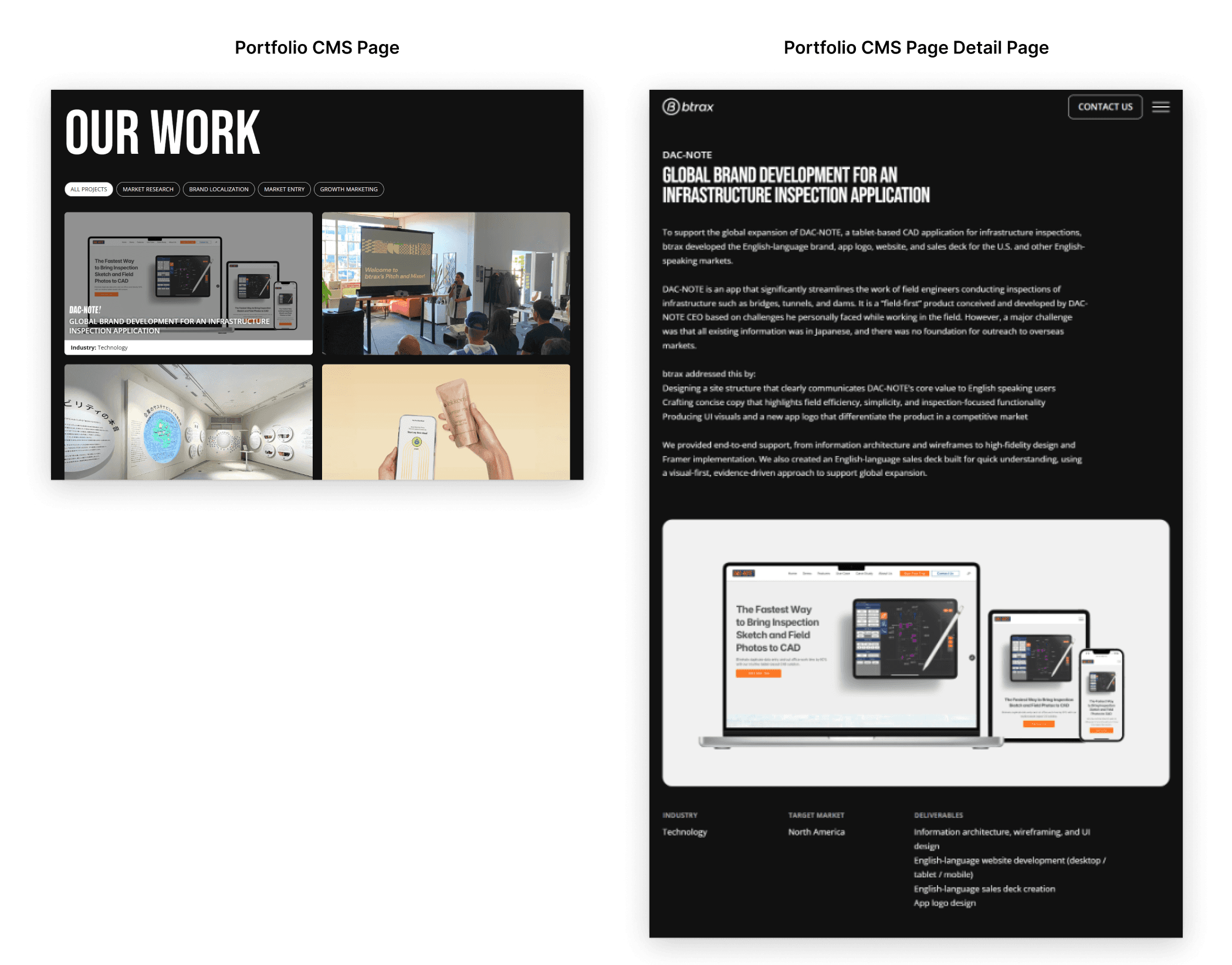
CMS-driven project gallery
Filtering by project type
Easy expansion without redesign
Careers CMS (new)
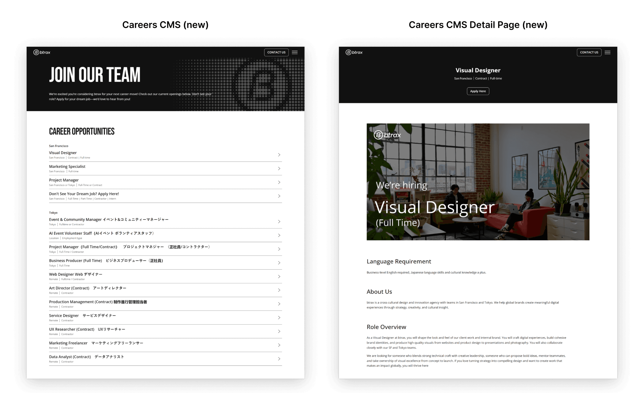
I designed and built a CMS-driven Careers page, which did not exist previously.
This allowed the marketing team to:
Add, update, and remove job listings independently
Share roles via social media
Capture interest from visitors exploring the site organically
Ebook Automation (Zapier + Formspark + Mailchimp)
To support content distribution and lead capture, I connected the site to:
Formspark for form handling
Zapier for automation
Mailchimp for email delivery

When users download an ebook:
Their information is captured
They automatically receive the ebook via email
Marketing gains a scalable, low-maintenance workflow
“The site needed to work beyond launch day — for marketing, recruiting, and ongoing growth.”
SEO, AIO & GEO Improvements
To improve discoverability, I researched AI Optimization (AIO) and Generative Engine Optimization (GEO) and implemented structural enhancements across the site.
Key updates included:
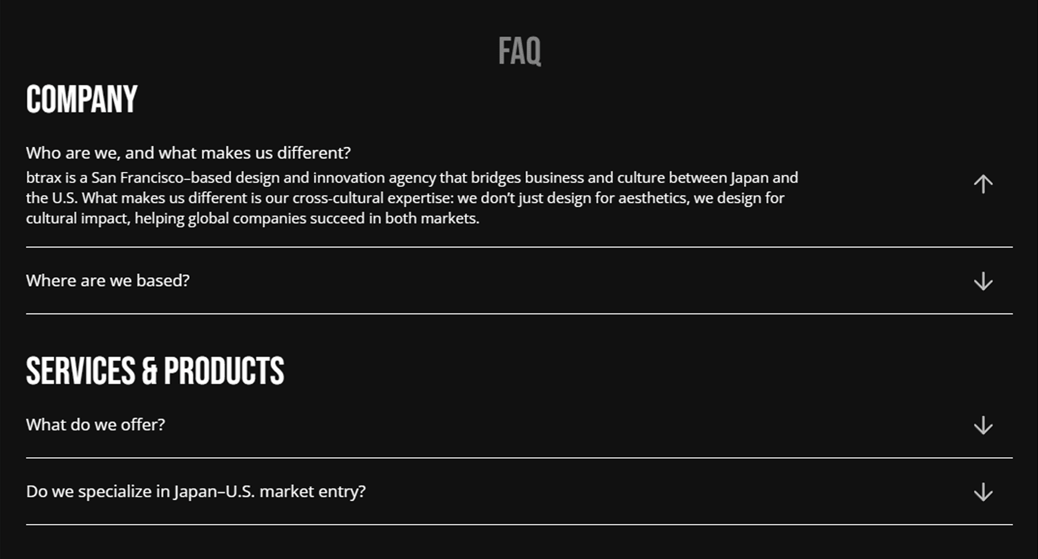
A dropdown FAQ section on the About page to surface high-intent, structured content
Improved Schema markup to better communicate organizational context and services to search engines and AI systems
These changes ensure the site is optimized not just for users, but for how content is increasingly interpreted and surfaced by AI-driven search experiences.
Execution & QA
Key challenges included:
Managing CMS complexity alongside legacy content
Ensuring responsiveness for layered, 3D-inspired layouts
Maintaining quality under tight timelines and stakeholder feedback loops
QA included:
Multi-device testing
Cross-browser testing
Content validation
Pre-launch checklist and final review
Despite late-stage scope changes—including the addition of a custom hero video—the project launched ahead of schedule.
Launch & Impact
After launch:
Marketing could update pages and careers content without design support
Speed to publish increased
Internal confidence in the website improved
Messaging felt clearer and more cohesive
I continued owning the site post-launch, supporting ongoing updates, new pages, iteration, and maintenance.
Let’s continue the conversation
If my approach to design resonates, I’d love to connect. I’m always open to thoughtful conversations about web systems, collaboration, and building work that lasts.