ZEON Ventures Website Redesign
Project Overview
Zeon Ventures required a modern, scalable website redesign to replace an outdated digital presence and better reflect their role as a forward-looking investment firm.
The goal of this project was to establish a credible digital foundation that clearly communicates Zeon’s mission, showcases its partners and portfolio, and provides a flexible platform for ongoing content and growth.
I collaborated with a small team to redesign the site from the ground up, translating existing messaging into a clear content hierarchy, defining the brand color system, and designing and developing a fully responsive website in Framer.
Timeline
4 Months
My Role
Web Design + Brand Design + Framer Development + Framer CMS + Micro-Interactions
Client
ZEON Ventures
Website Link
Tools
Figma + Framer
The Problem
Zeon Ventures had an existing website, but it no longer reflected the firm’s positioning or supported long-term growth.
The existing site was content-heavy and difficult to navigate, making it hard for visitors to quickly understand Zeon’s mission and credibility
The brand needed to establish trust immediately in a competitive investment landscape
Zeon’s investment focus and partnerships were not clearly communicated
Content updates required ongoing design support, limiting scalability
The challenge was to restructure and modernize the site, transforming it into a clear, credible, and scalable platform while preserving the firm’s core messaging.
The solution needed to balance trust, clarity, and future growth.
My Role & Constraints
I was responsible for:
Wireframing and structuring key pages
Defining the brand color system and usage guidelines
Designing and developing the website in Framer
Implementing responsive layouts and micro-interactions
Supporting CMS setup for ongoing content updates
This work was completed within a four-month timeline, with frequent client collaboration and iteration.
Structure & Key Decisions
Rather than starting with visuals, we focused first on structure and content hierarchy.
The existing site contained valuable information, but lacked clarity, hierarchy, and a scalable layout system.
The homepage structure evolved as priorities became clearer through iteration and client feedback.
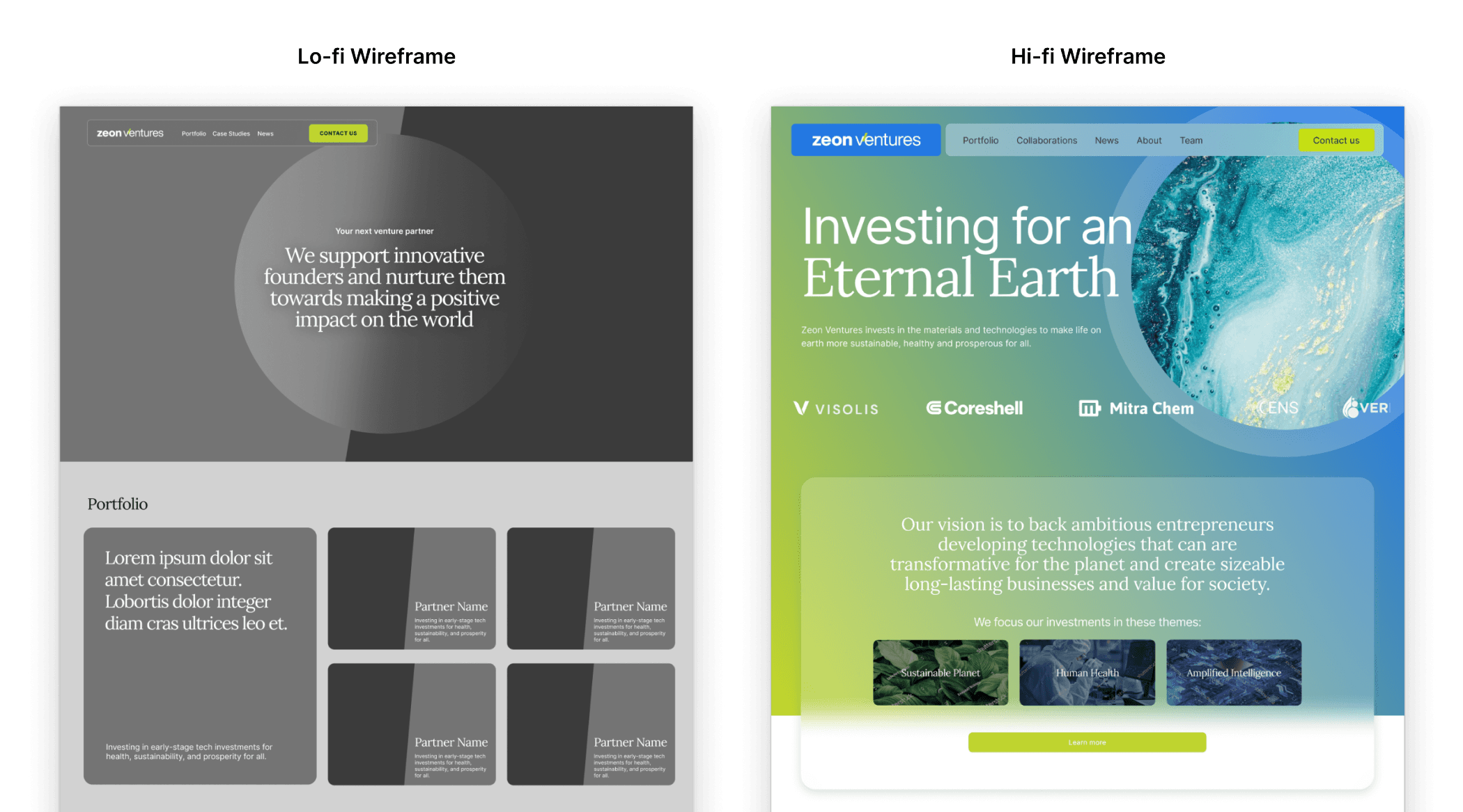
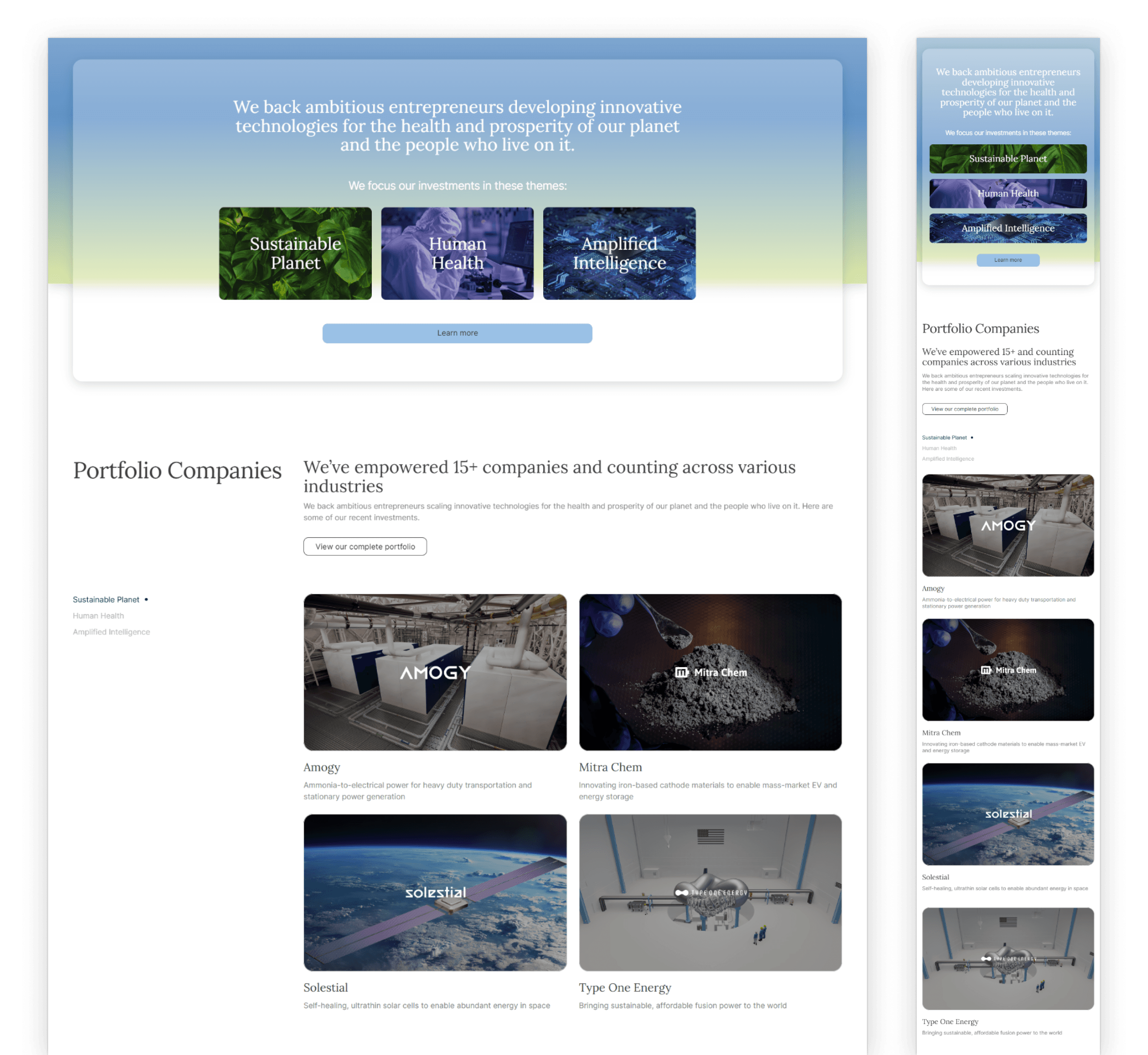
Content Hierarchy
The homepage was structured to guide users through:
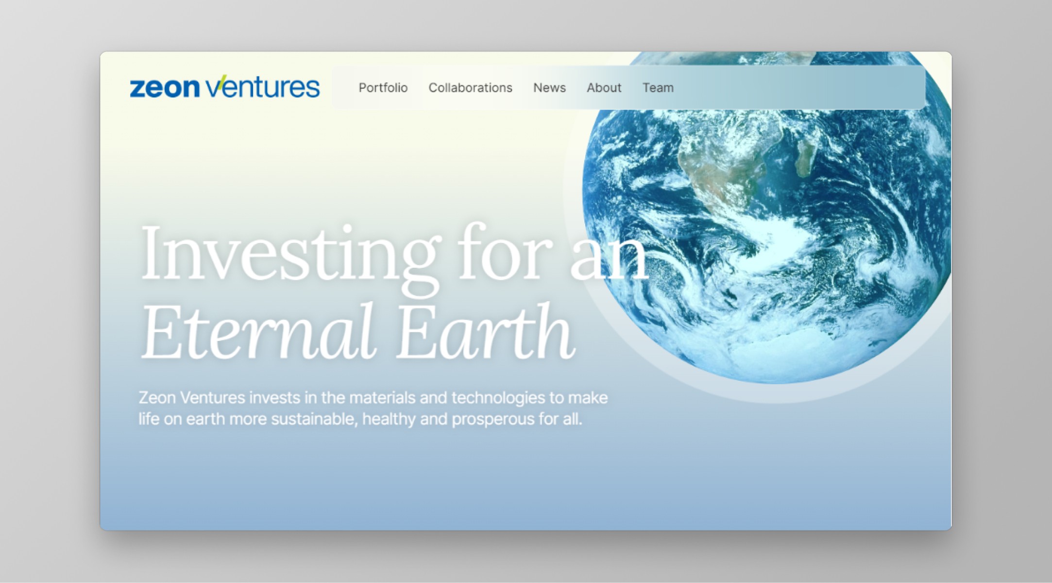
"Who Zeon Ventures is and why they’re credible"
"What industries and initiatives they invest in"
"Who they partner with and support"
"How they share ongoing insights through content"
This ensured first-time visitors could quickly understand Zeon’s purpose without digging.
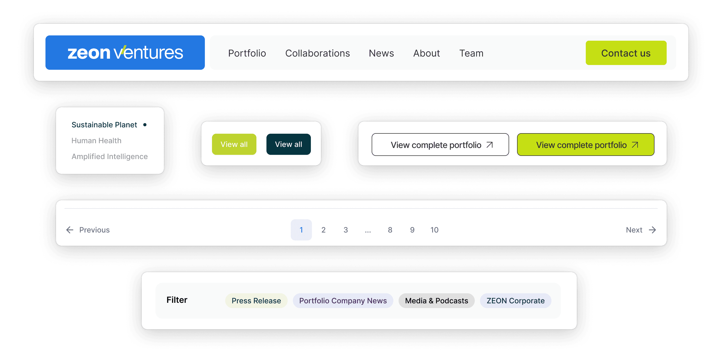
Navigation Decisions
Navigation was intentionally kept minimal and focused, reducing friction and helping users reach key information quickly without overwhelming choices.
Modular Layout Logic
Pages were built using reusable, modular sections, allowing content to scale while maintaining consistency and minimizing long-term maintenance effort.
Branding & Identity
We explored three initial brand directions, technology-driven, nature-inspired, and futuristic, before aligning on a direction that balanced innovation with credibility.
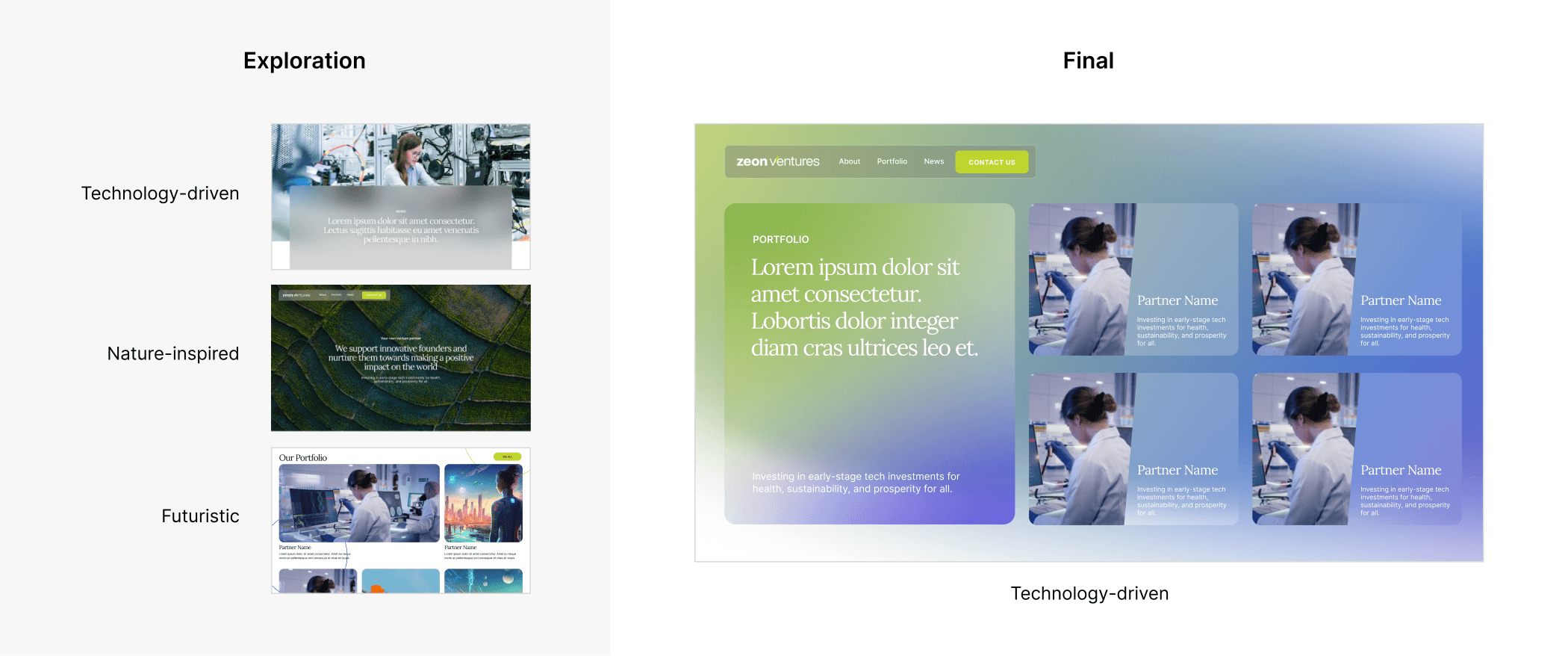
Once the final direction was selected, I translated the brand into a scalable visual system designed for long-term consistency across the website.
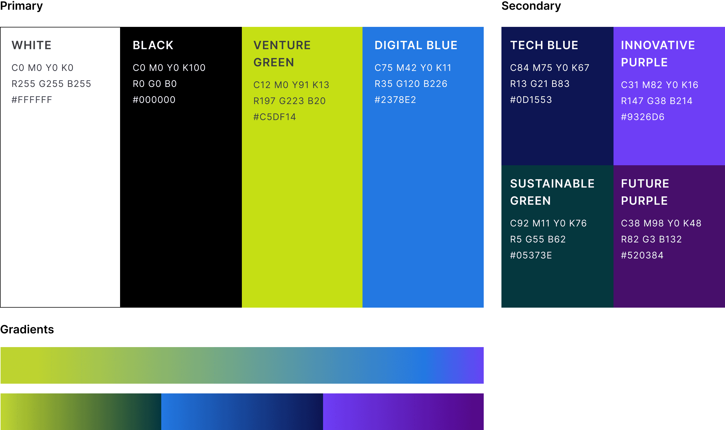
Primary and secondary palettes
Hex values and usage guidelines
Application examples across web layouts
I led the development of the color system, defining clear rules for: primary and secondary palettes, usage guidelines, and application across web layouts to ensure consistency and scalability.
The brand system was then translated into a flexible UI component library, ensuring visual consistency, accessibility, and scalable interaction patterns across the site.
The final palette reinforced sustainability while maintaining a professional, investment-focused tone.
What Made This Successful
This project succeeded because it focused on systems, not just screens.
By restructuring an existing content-heavy site into a modular, scalable system, Zeon gained a platform built for long-term growth rather than one-off updates.
The site establishes trust and credibility through clear messaging and polished presentation
Partners and portfolio companies are showcased in a structured, easy-to-navigate format
A CMS-powered blog allows Zeon to publish articles and insights independently
Modular page templates enable future content expansion without redesign
Interactive Investment Themes
A key challenge was communicating Zeon Ventures’ different investment themes in a way that felt clear, engaging, and easy to explore.
The client initially envisioned a static list of themes, but I proposed a plan of action that translated this idea into an interactive experience. I designed and built an interactive list where selecting a theme dynamically updates the content and causes the corresponding visual to highlight and rotate into view.
This interaction transformed abstract investment concepts into a more intuitive and digestible experience, while remaining lightweight and easy to maintain within Framer.
Outcome & Impact
Fully launched responsive website built in Framer
Established a clear, credible digital presence aligned with Zeon Ventures’ mission
Improved how the team communicates venture progress to the broader startup ecosystem
Enhanced storytelling, usability, and functionality to support awareness and engagement
Built scalable CMS and reusable page templates enabling ongoing content publishing without design support
Client Feedback
“The web redesign has been very helpful for us. The aesthetics, storytelling, and added functionality have all contributed to helping us raise awareness and share our progress with the venture ecosystem.”
— Client feedback, Zeon Ventures
Final Responsive Views
The final site was designed and built to be fully responsive across desktop and mobile devices.
Let’s continue the conversation
If my approach to design resonates, I’d love to connect. I’m always open to thoughtful conversations about web systems, collaboration, and building work that lasts.