Wismettac Website Redesign
Project Overview
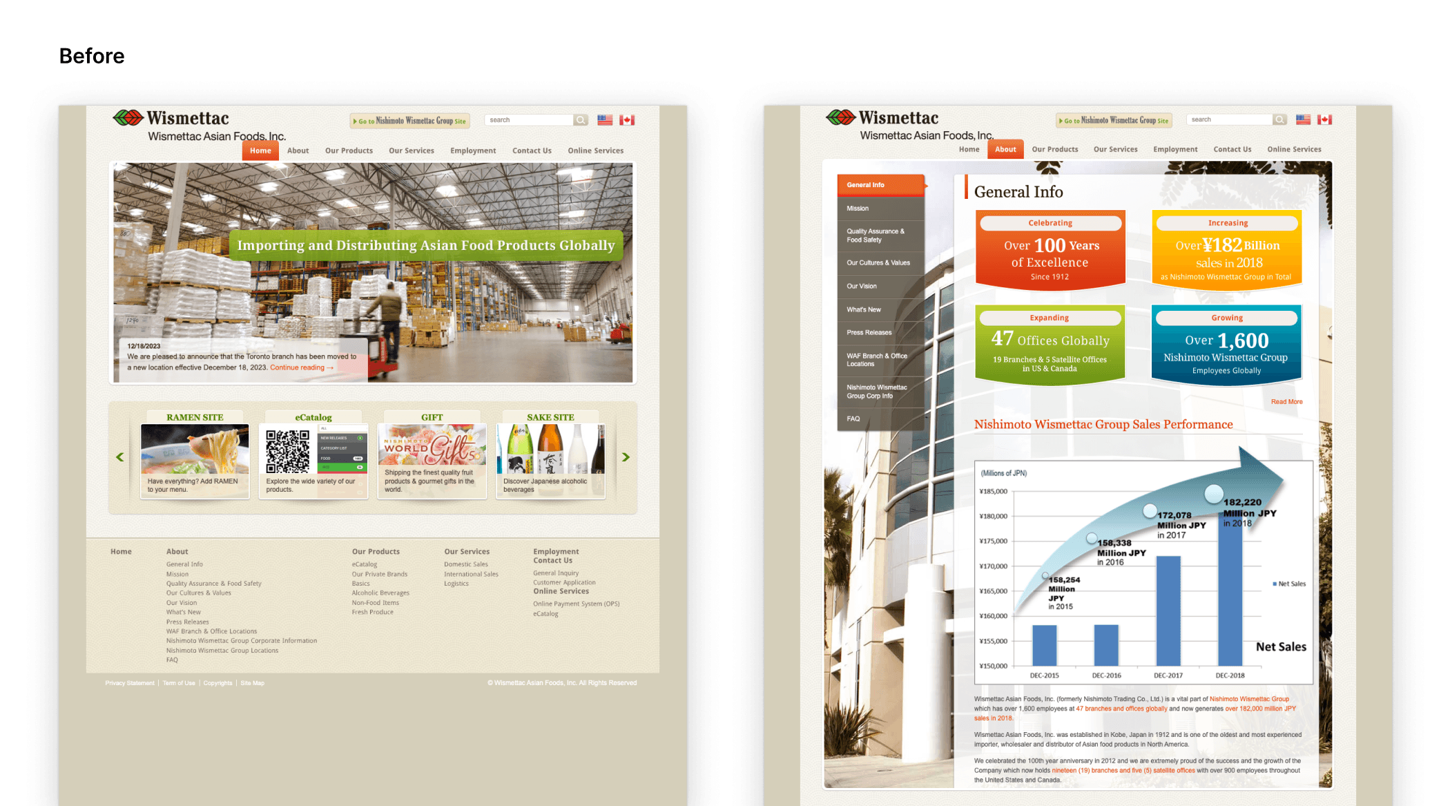
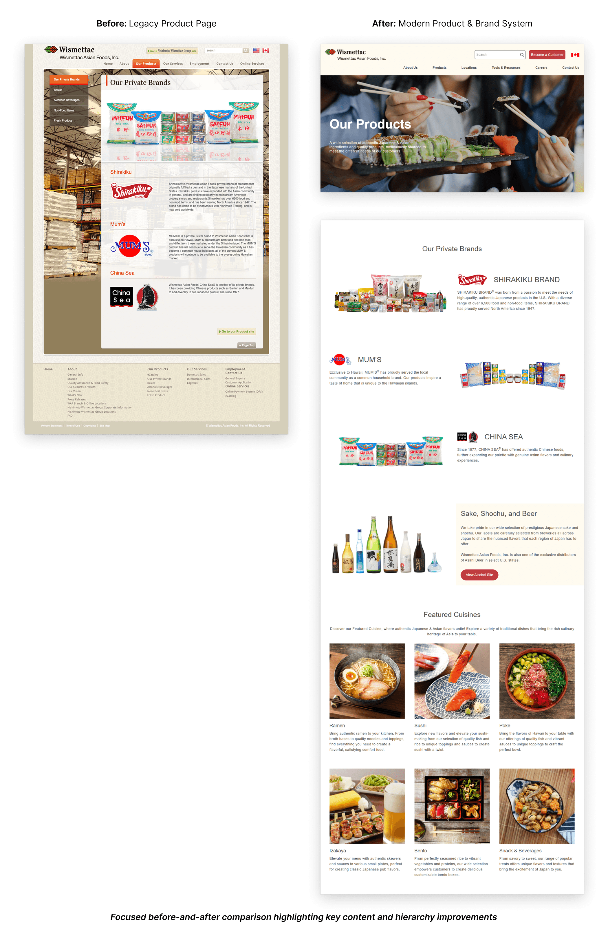
Wismettac is a global food distributor with decades of history and deep partnerships across North America and Asia. While the company had strong operational credibility, its website, largely unchanged since the early 2000s, no longer reflected the scale, trust, or professionalism of the brand.
The goal of this project was to redesign Wismettac’s U.S. website to establish credibility with modern B2B audiences, improve clarity and navigation, and position the brand competitively within the North American food distribution landscape, without losing the trust built over decades.
Timeline
4 months
My Role
Design Direction + Design Strategy + Web Design + Competitive Research + Information Architecture
Client
Wismettac Asian Foods
Project Link
Tools
Figma
My Role
Design Lead
Led design direction from project kickoff through handoff
Facilitated stakeholder presentations and alignment workshops
Conducted website audit and competitive research
Defined sitemap, information architecture, and early wireframes
Developed visual direction, color system, and final style guide
Prepared engineering-ready design documentation
The Problem
Wismettac’s existing website created unintended friction for potential partners.
Despite being a trusted distributor, the site’s outdated structure, dense layouts, and legacy navigation patterns made it difficult for new vendors to quickly understand what Wismettac does or why they should trust them.
In plain terms:
The site felt outdated, which risked undermining credibility
Information was hard to scan and navigate
The design did not meet modern expectations for mobile responsiveness
The brand lacked a clear positioning relative to major competitors
For a B2B audience evaluating partnerships, this created hesitation at the very first touchpoint.
Defining Success
Success was defined simply:
Potential clients should trust the website and feel confident reaching out for business.
That meant:
Clear communication within seconds
A professional, modern visual system
A structure that balanced efficiency with brand credibility
A site that felt current, reliable, and intentional
Research & Discovery
Website Audit
I began with a design and usability audit to identify where the existing site was breaking down.
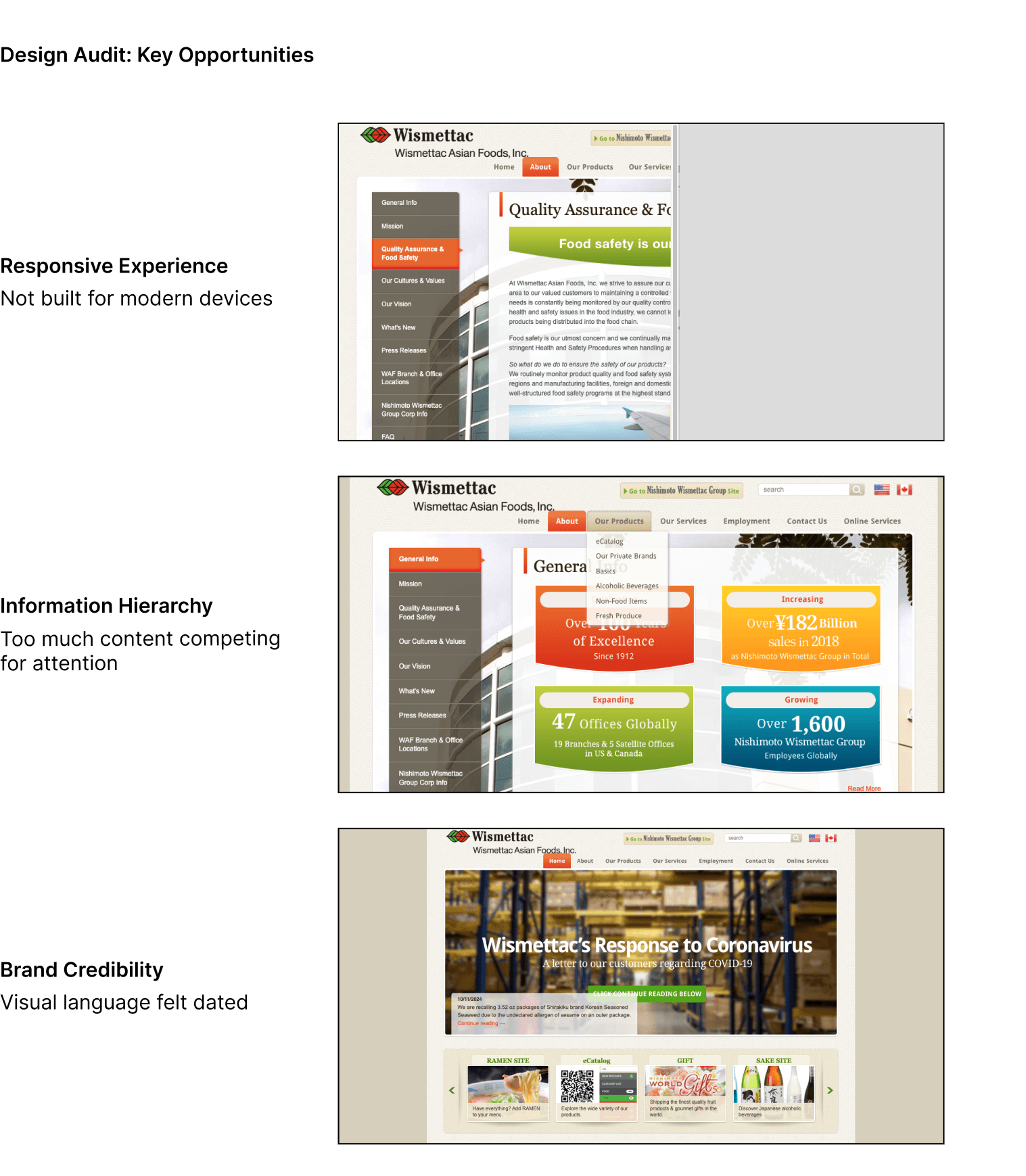
Key issues surfaced quickly:
Non-responsive layouts across devices
Overly dense content with little hierarchy
Legacy navigation patterns that obscured key information
Minimal use of imagery to support trust and storytelling
Rather than framing this as a “visual refresh,” the audit positioned the redesign as a credibility and clarity problem.
Competitive Landscape
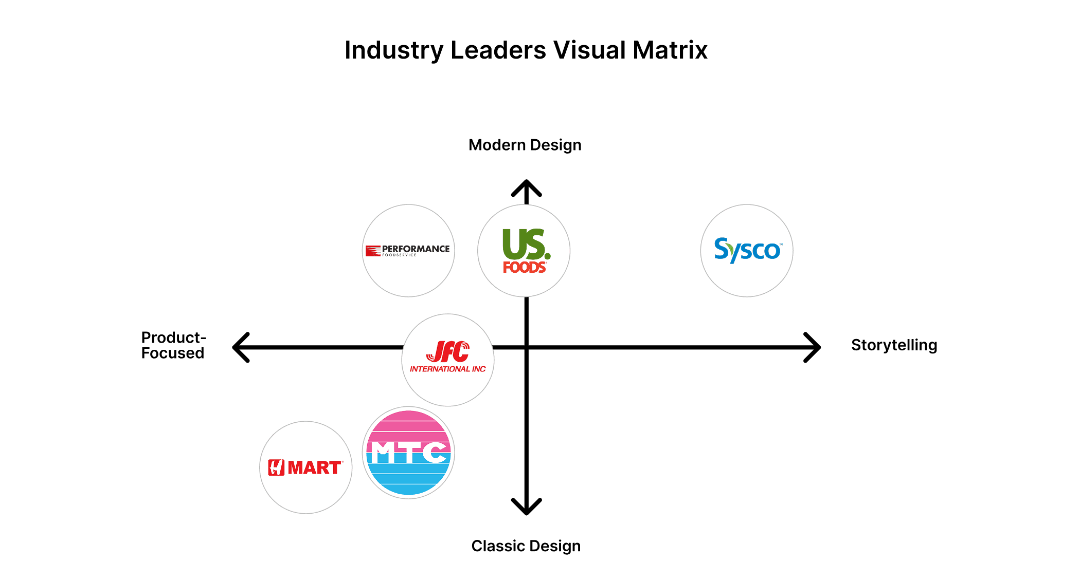
This revealed a clear tradeoff: product clarity vs. storytelling.
To ground decisions in reality, I analyzed Wismettac’s direct competitors, including Sysco, US Foods, Performance Foodservice, JFC, H Mart, and MTC.
From this analysis, I identified two dominant patterns across the industry:
Product-first, efficiency-driven sites optimized for fast browsing
Story-driven, trust-building sites focused on brand narrative and scale
I translated these findings into a visual positioning matrix, mapping competitors along two axes:
Product-focused ↔ Storytelling
Classic (legacy) ↔ Modern design
This created a shared language for discussing design direction with stakeholders.
Design Strategy: Finding the Right Balance
Rather than forcing Wismettac into an existing category, the opportunity was to define a true midpoint.
Stakeholders wanted clarity, efficiency, and product focus
The design needed stronger storytelling and trust signals for new audiences
I proposed two initial design directions:
Direction A: Clean, modern, imagery-led storytelling for trust
Direction B: Product- and service-focused layouts optimized for clarity
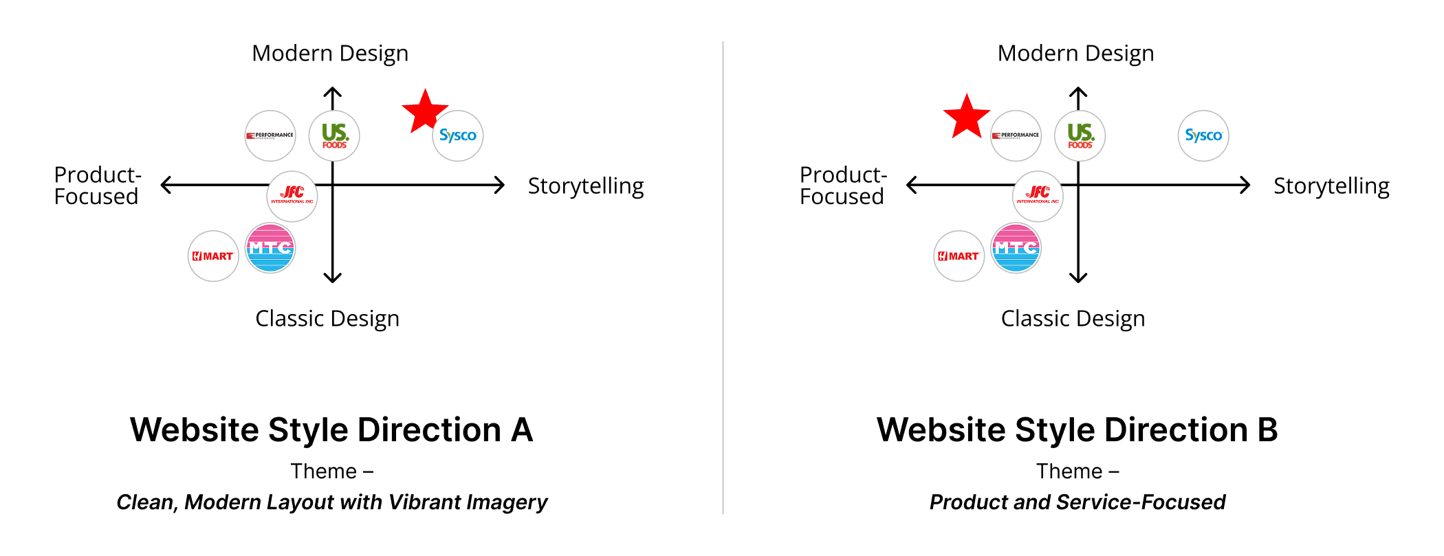
Through stakeholder reviews, it became clear that neither direction alone was sufficient.
The solution was a hybrid system—combining the strengths of both while avoiding their extremes.
The Hybrid Approach
What We Took From Each Direction
From Direction A
Clean layouts with strong visual hierarchy
Human-centered imagery to reinforce trust
Space for brand story, scale, and credibility
From Direction B
Product-first content blocks
Straightforward layouts for quick scanning
Clear paths to services, tools, and contact
What We Intentionally Avoided
Overly cold, catalog-style layouts
Excessive storytelling that slowed task completion
Visual noise that distracted from clarity
This balance allowed the site to feel both approachable and efficient.
Information Architecture & Structure
I collaborated with other designers to develop a new sitemap and information architecture that better aligned with how North American users expect to navigate B2B sites, while working closely with Japanese-speaking stakeholders to ensure clarity and alignment across teams.
Key changes included:
Clear, audience-friendly navigation labels for a U.S. market
Introduction of a dedicated About Us section to better communicate Wismettac’s story and values
Grouping legacy tools under clearer Tools & Resources language
Introducing a prominent Become a Customer call-to-action to support lead clarity
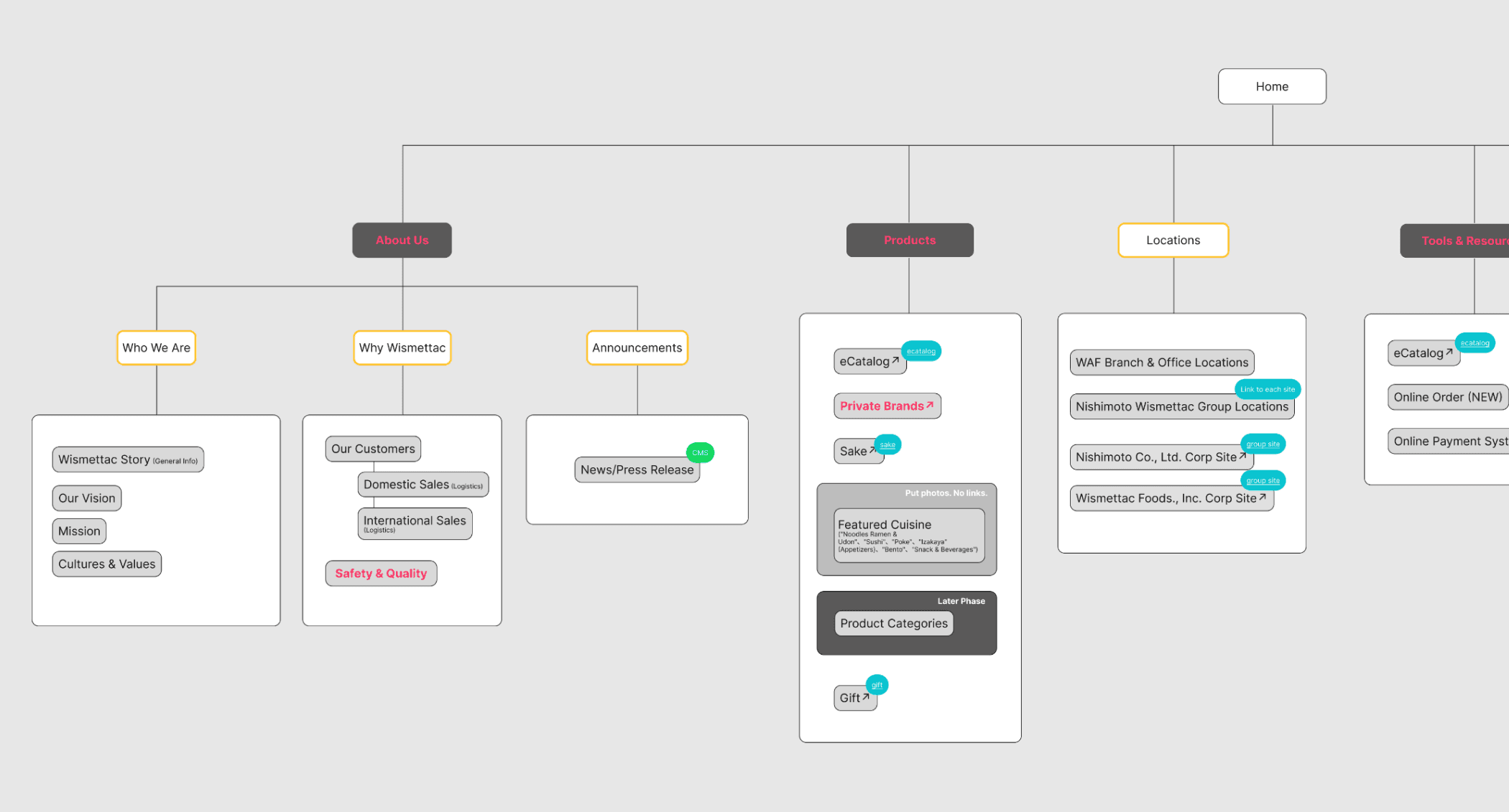
Zoomed view of the final sitemap highlighting top-level navigation and key content groupings, informed by North American B2B navigation patterns
The resulting structure supported both exploration and quick decision-making, balancing stakeholder needs with user expectations.
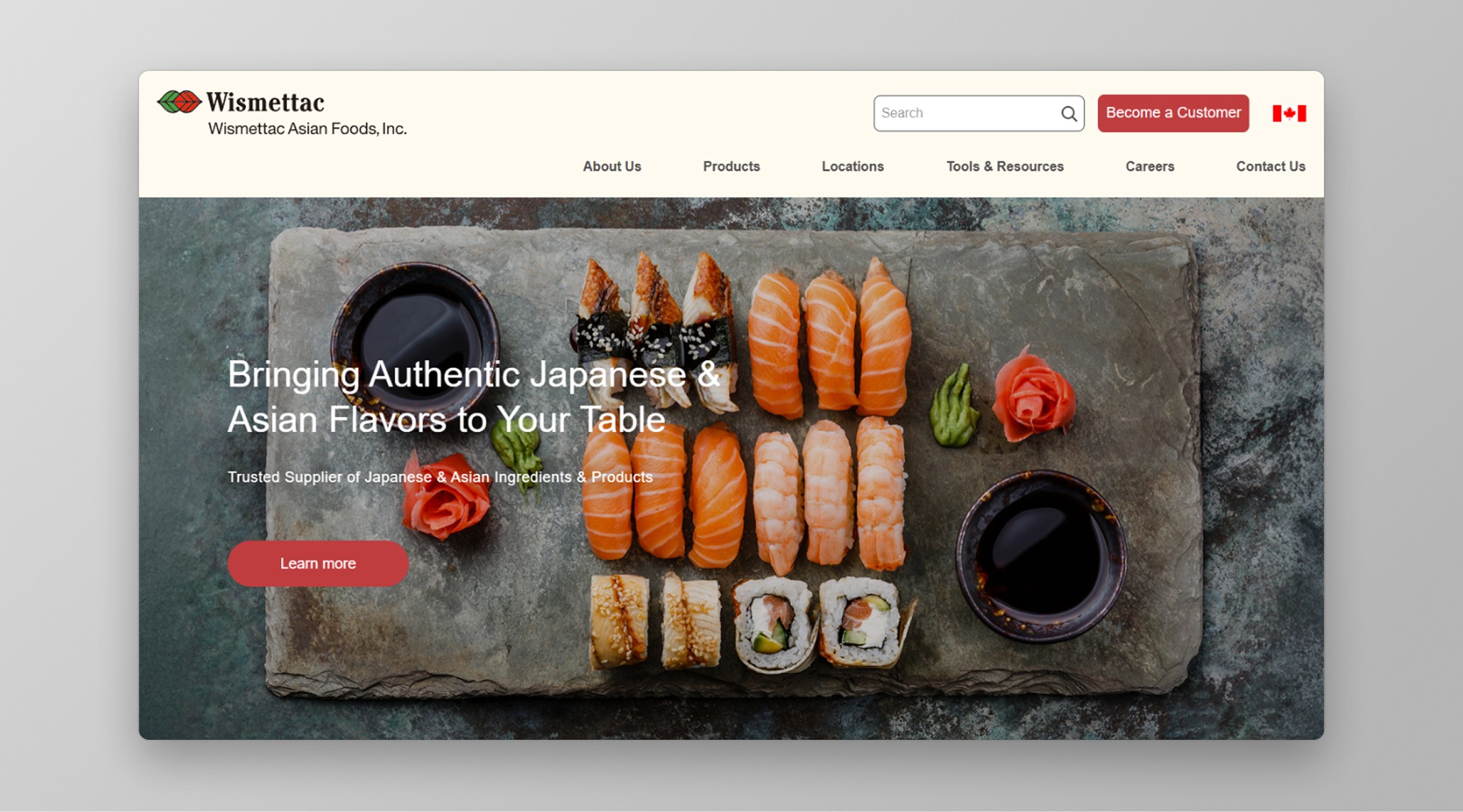
Visual System & Color Strategy
Color played a critical role in balancing trust, warmth, and usability.
Red—already a core brand color—was intentionally used for calls-to-action, aligning with both food industry norms and usability best practices. Supporting neutrals and warm tones helped soften the interface, maintain readability, and reinforce a sense of composure and professionalism.
I presented multiple color concepts before converging on a system that blended:
Brand continuity
Cultural familiarity
Modern restraint
This culminated in a final U.S. website style guide that engineering and internal teams could confidently build from.
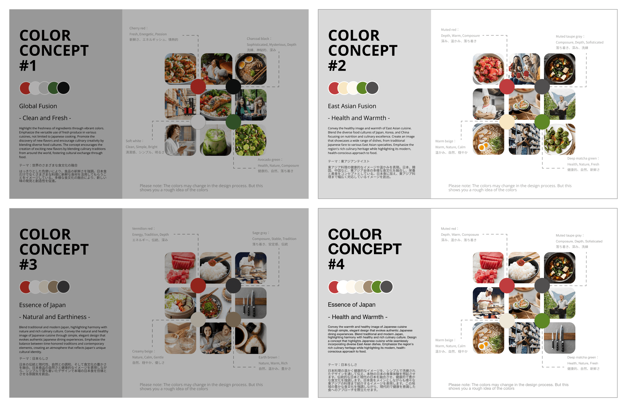
Selected color concepts (#2 and #4) used to define the final U.S. visual system
These principles were then translated into a flexible UI system that could scale across pages, content types, and user needs.
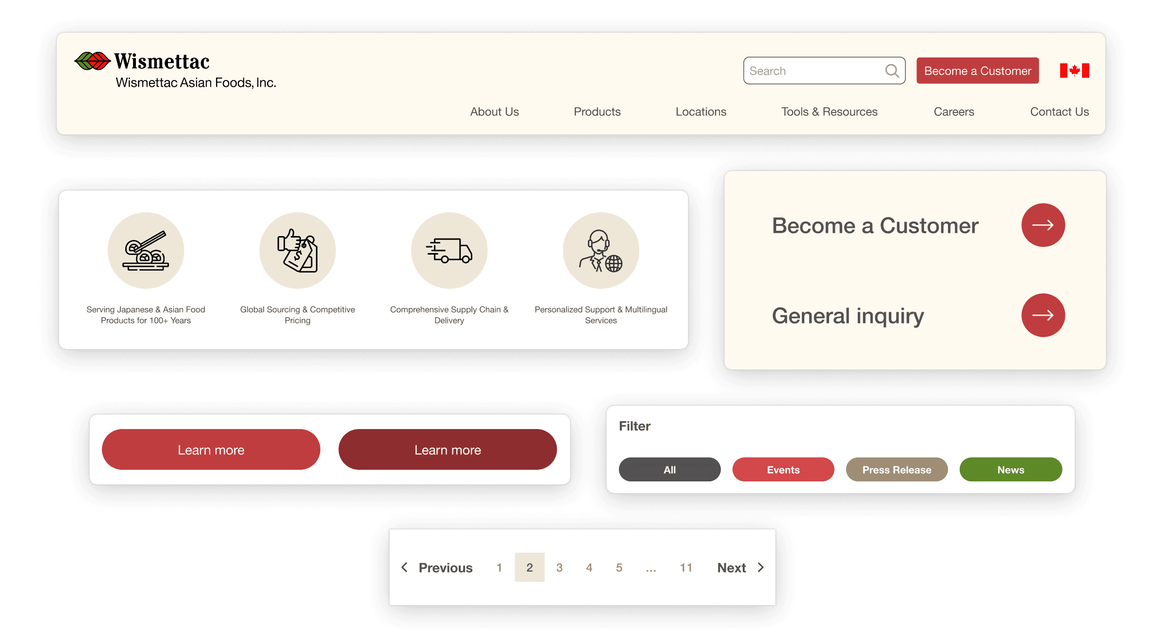
Final applied UI system showing CTA hierarchy, reusable components, and consistent color usage across key page sections
Build Readiness & Handoff
While Wismettac’s internal engineering team handled development, the design work was prepared with real-world implementation constraints in mind and closely aligned with teammates supporting Japanese-language handoff.
Deliverables focused on enabling a smooth transition and included:
Annotated Figma files to clarify layout intent
Clear guidance around spacing, hierarchy, and component usage
Defined color and typography rules for consistency
Flexible patterns that allowed internal teams to extend the system over time
Micro-interactions & scroll-triggered motion designed to guide attention, reinforce hierarchy, and enhance clarity as elements entered the field of view
The goal was not just a finished design, but a usable and scalable foundation that internal teams could confidently build upon.
Outcome
The redesigned website established a more credible, modern presence that better reflects Wismettac’s scale and reliability.
While quantitative metrics were not tracked post-launch, the redesign succeeded in its primary objective:
Building trust
Clarifying value
Creating a foundation for future growth
Reflection
The most challenging part of this project wasn’t visual execution, it was guiding stakeholders through strategic tradeoffs.
By grounding decisions in research, competitive context, and clear positioning, I was able to align multiple perspectives into a single, coherent system that felt authentic to the brand while meeting modern expectations.
Let’s continue the conversation
If my approach to design resonates, I’d love to connect. I’m always open to thoughtful conversations about web systems, collaboration, and building work that lasts.