
Six Sigma Talent | WIX Web Design
Project Overview
I led the design of a bilingual website for a Japan-based recruitment agency, transforming their PDF-based client materials into a clear, modern digital experience designed to build trust and generate qualified leads.
I collaborated with another designer who supported Japanese translation and localization, ensuring both language experiences remained consistent and high quality.
Timeline
1 Month
My Role
Web Design + WIX Development
Client
Six Sigma Talent | WIX
Project Link
Tools
Figma + WIX
The Problem
Six Sigma Talent relied on static PDFs to explain their services to potential clients.
This made it difficult to establish credibility online, guide new users, and support both English and Japanese audiences through a single, cohesive experience.
Key constraints
No existing website
Fully bilingual requirement (English + Japanese)
Tight 1-month timeline
The site needed to encourage conversation, not content overload
Strategy
Rather than replicating long, content-heavy recruitment websites, we designed a concise, system-driven experience focused on clarity, trust, and speed.
Core decisions
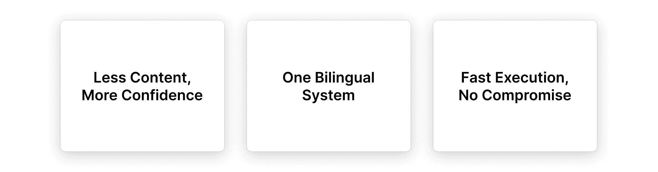
Less content, more confidence
Surface only what users need to understand the offering and feel comfortable reaching out.One bilingual system
Design English and Japanese pages as a single system, not separate experiences.Fast execution without visual compromise
Anchor the design system to existing sales materials to move quickly while staying cohesive.
Information Architecture & Flow
The site was structured to guide users from understanding to action as quickly and clearly as possible.
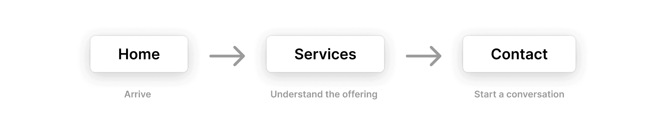
Flow
Homepage → Service Overview → Contact
Minimal page count
Clear narrative on every page
Design System Decisions
Typography

Headings: Space Grotesk
Body: Inter
Chosen for their modern tone, strong legibility in both English and Japanese, and alignment with existing sales materials.
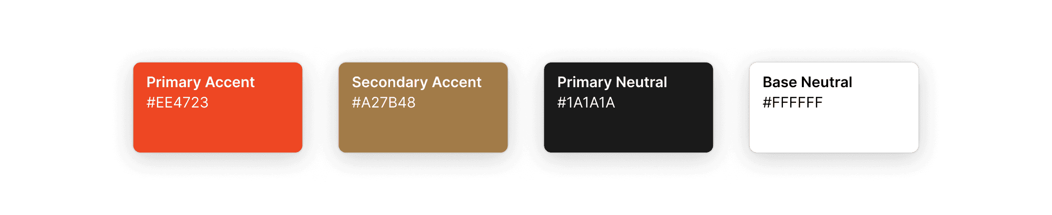
Color & Visual Language
Colors derived directly from the client’s sales deck
Used sparingly to reinforce hierarchy and credibility
Clean layouts prioritized over decorative elements
Localization
Collaborated with a designer supporting Japanese translation and localization
Adjusted spacing and line breaks for Japanese text
Maintained consistent hierarchy and visual rhythm across languages
Ensured neither language felt secondary
Key Screens
Rather than presenting a full gallery, we focused on three proof moments that demonstrate the system in action.
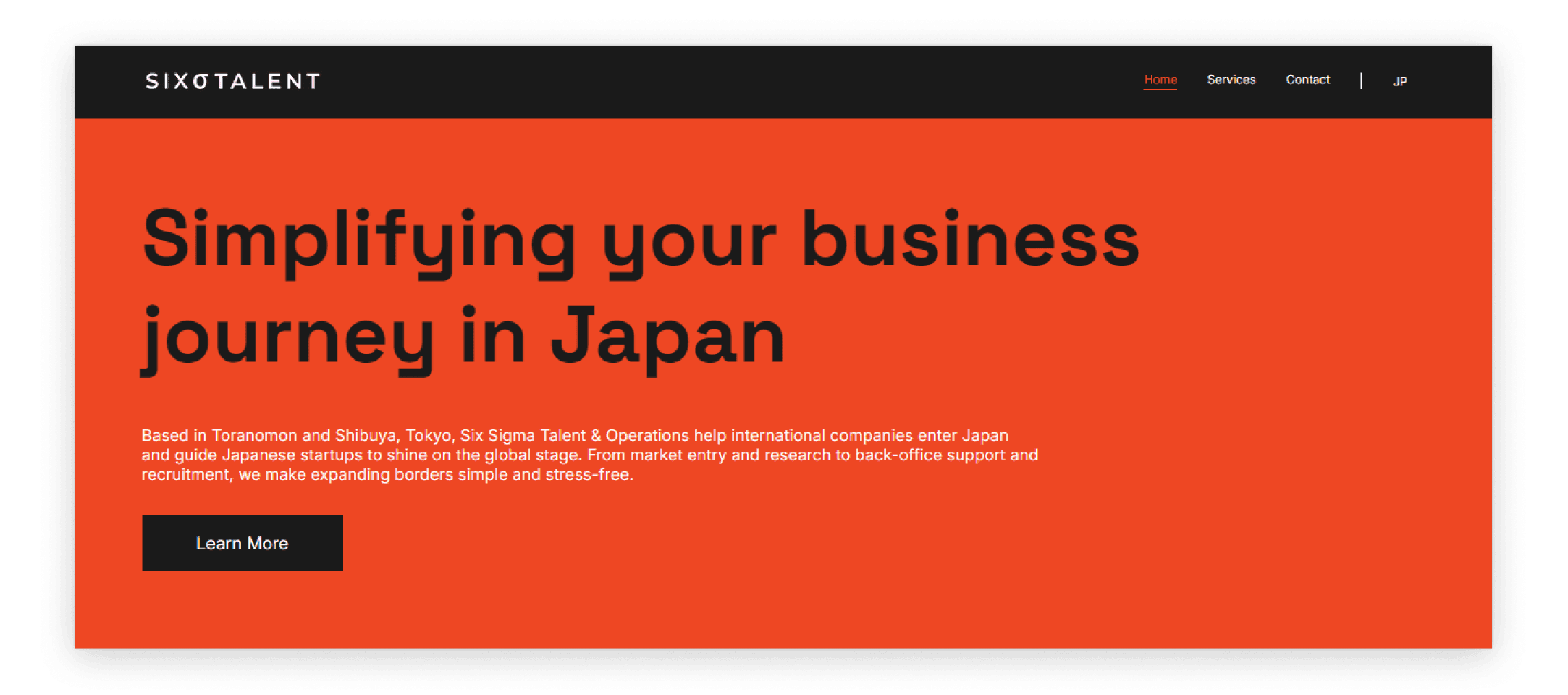
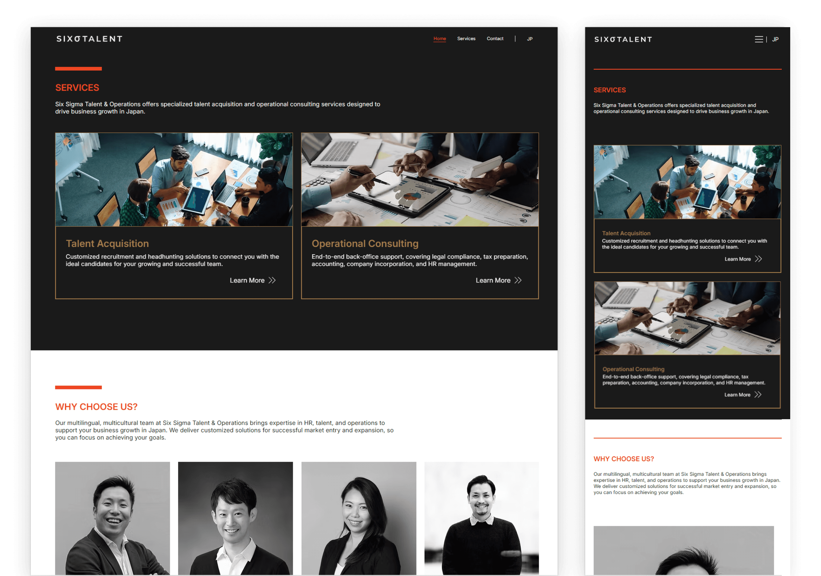
Homepage
Clear value proposition
Immediate credibility signals
Strong primary call to action
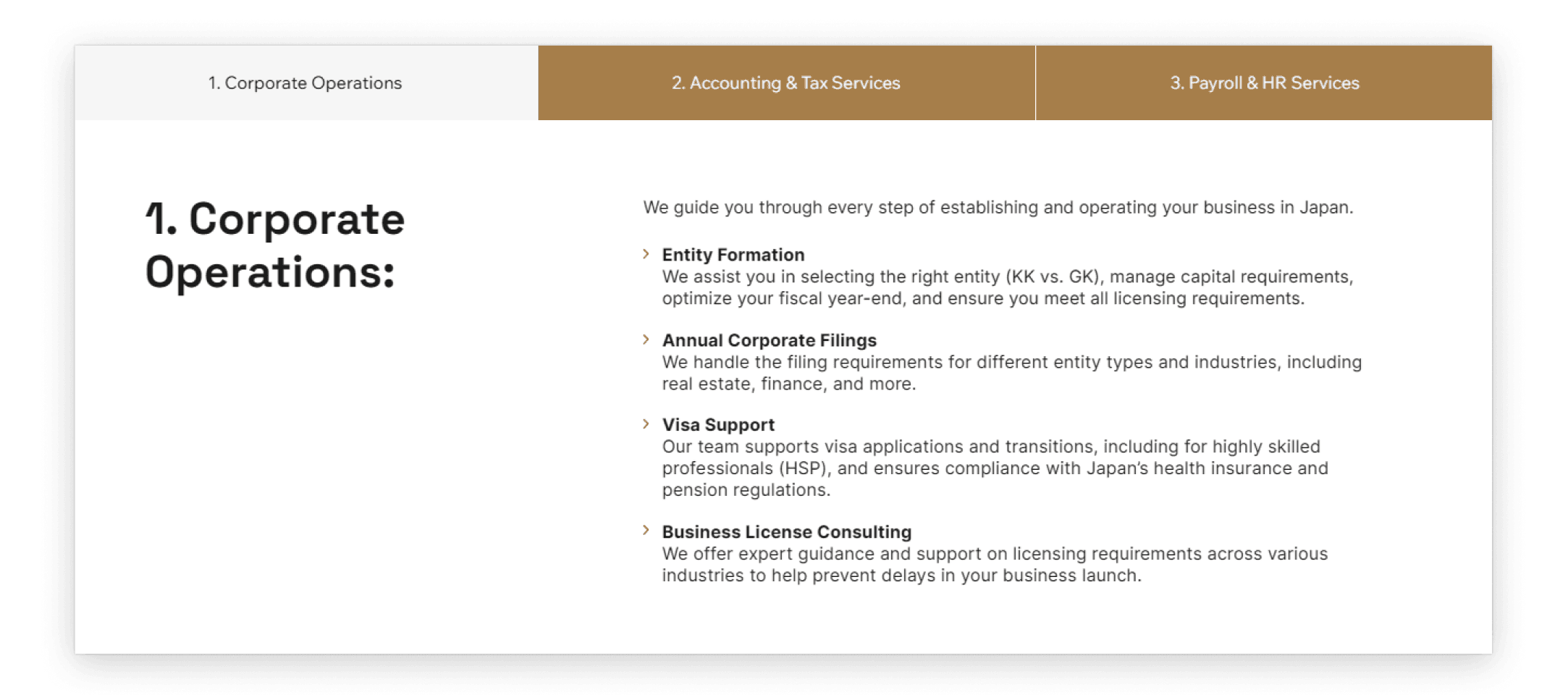
Services
Scannable structure
Minimal, confident messaging
Designed to support conversation, not overwhelm
Explaining Value Through Motion
Before-and-after animation to communicate simplification
Replaces dense explanation with visual clarity
Reinforces “less content, more confidence”
Contact
Low-friction entry point
Approachable and human, not transactional
Responsiveness
The website was designed and built to be fully responsive, maintaining clarity, hierarchy, and usability across desktop, tablet, and mobile.
Outcome
Website delivered on time
Fully bilingual, responsive experience launched
Positive feedback from both the client and Wix
Featured by Wix as an example of Wix Studio’s capabilities under a tight timeline
Most importantly, the site now serves as a confident first impression, replacing static PDFs with a clear, modern system that supports meaningful client conversations.
want to know more?
I’m excited to join a team where can contribute, grow, and build thoughtful design experiences in collaborative environments.
If you're looking for someone who’s ready to dive in and make a difference.